research×design-system×ui·ux×prototyping
The beginning
When the new product development was kicked-off, Smart Reporting's current product still was an academic solution.
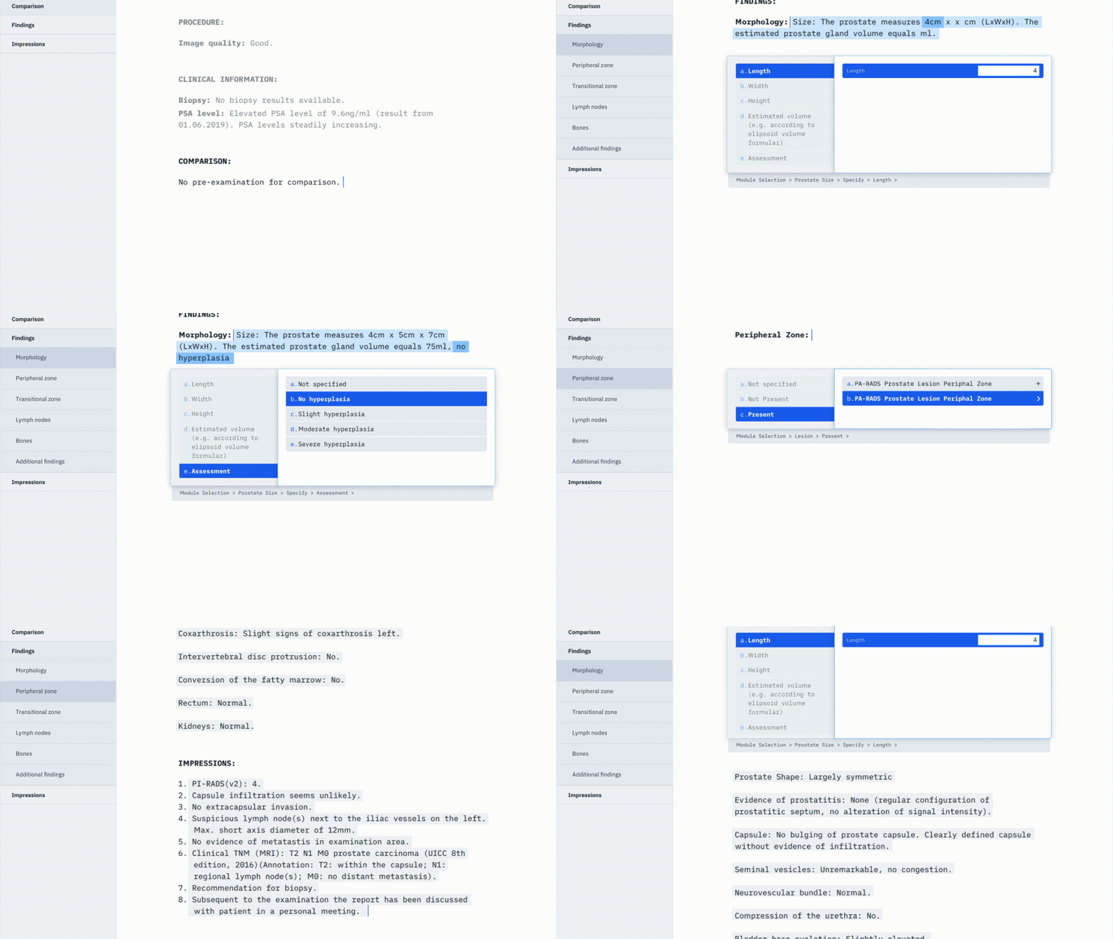
So the first question that arose was how a product for radiologists would look like that emphasizes the critical metrics of a doctor's daily routine:
Fastness & Completeness.
Research & Interviews
During the research phase, it became evident that the current solution was very cluttered and did not adapt well to a radiologist's workflow.
The current product forced every radiologist into a template's click path, which doesn't feel natural because radiologists always start reporting on a blank page.

Recognition
Since we started to re-design the product, Smart Reporting became a serious radiology provider.
They landed huge deals to integrated their new product into RIS and PACS systems.